
I am a fan of sports jerseys. I have an entire closet of them from most of the major sports and several of the minor ones as well. So when I started following the National Lacrosse League almost 20 years ago, I started paying attention to what the teams were wearing.
There have been some fantastic uniforms in the NLL over the years. And some awful ones (does anyone still have nightmares about the Swarm’s old unis? They were an abomination, with their eye-scorching yellow and that weird honeycomb pattern on the shoulder and the stripes down the sides. It’s all too much!).
Just… Just no.
And then were were the years where the league adopted a single producer for all uniforms and suddenly they all kinda looked the same—same shoulders, same side panel with a gradient colour scheme, same neckline.
In my opinion, the NLL doesn’t have a genuinely bad looking uniform these days. A couple are unremarkable, but they don’t actually offend my eyes.
One of the things I’ve really liked recently is the addition of some extra helmet decoration for all the players—it takes an otherwise unremarkable, monochrome bucket and gives it some style, which I appreciate.
The entire In Lacrosse We Trust writer’s group was polled to come up with these rankings, with me breaking any ties. Because I’m writing this piece.
So without any further ado, let’s see which team is the best looking and which team needs to reconsider their fashion choices:
Special Mentions
Personally, I’m not a fan of alternate jerseys, or special occasion jerseys. They always strike me as just a cash grab to get a few extra bucks out of fans and they rarely actually look good. But a couple of these were specifically noted by our staff as being pretty cool.
The first, getting the most love, is the Toronto Rock Indigenous Jersey, paying homage to the creators of the sport. Designed by Indigenous artist Tracey Anthony, this one looks really good and features a number of key design elements that speak to his heritage.
The San Diego Seals also got some love for their black alternate jersey. The team logo dominates the front, with the purple that is their primary colour entirely absent from the look.
National Lacrosse League)
Finally, a shout out to the Rochester Knighthawks for their alternate jersey worn on Blackout Night, supporting the Upstate Collegiate Box Lacrosse League, with a hawk prominently featured on a black background. This is arguably a better looking piece of gear than the regular home jersey for the K-Hawks.
https://twitter.com/RocKnighthawks/status/1497738576259395588
And now, the list:
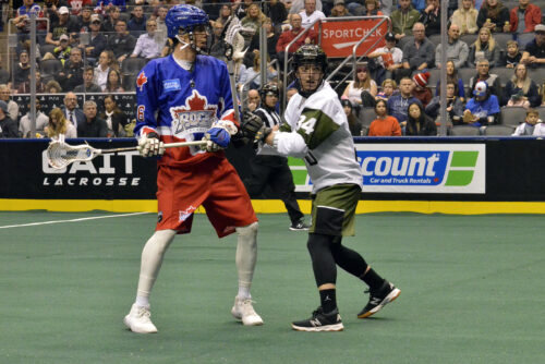
14: Calgary Roughnecks
I’m a Calgary boy, so my opinion is biased, but I used to think that the Roughnecks had one of the best-looking uniforms in the league, taking the always-popular red, white, and black colour scheme and adding a cool logo as well as some stylish oil derrick markings. The look really worked for me. But in 2022, the team added a new sponsor who has paid for a new teal floor for the Saddledome and changed the colour scheme to black and white, with a bit of grey. You know, to liven it up.
It isn’t awful. But it sure is boring. I mean, there might be a problem when the thing that most draws your attention when looking at the jersey is a sponsor logo on the left shoulder.
No one on our staff rated the Roughnecks jerseys higher than 11th-best. That’s no way to win a style competition.
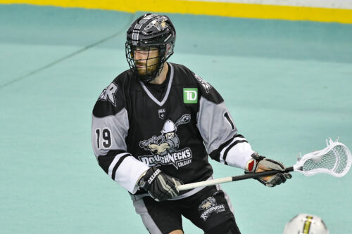
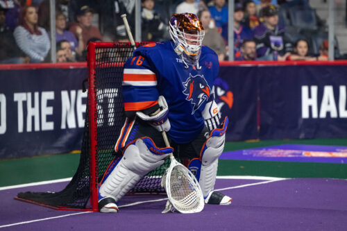
13: Rochester Knighthawks
Photo By Micheline Veluvolu
As with the Roughnecks, I was a big fan of the old Knighthawks uniforms (before they moved to Halifax and were immediately replaced by a different team, under different management, with the same name). The teal was unique and the overall design was really cool!
New management has gone with military olive green as the primary colour, with black and white accents. Again, like Calgary’s new outfits, I wouldn’t call these jerseys ugly. They just don’t really pop. Maybe at some point they’ll decide to make their cool alternate jerseys into the main look and the green stuff will be pushed to the back…
The Knighthawks scored as high as seventh on one ballot in our staff poll, but everyone else had them down in the basement with the Roughnecks.
12: Vancouver Warriors
Back when the Warriors called themselves the Stealth, they were one of four teams in the NLL with the same basic colour scheme of red, white, and black. In a league that had nine teams at the time. With the change of nickname came a change in uniforms.
Now the Warriors are decked out in black and gold, the only team in the league with that colour scheme, which gives them a little bit of a unique look. Their new logo is simple but distinctive. But overall, the uniforms, like the Roughnecks and Knighthawks, are just okay. Not awesome, but also not offensive.
In our poll, the Warriors jerseys placed as high as eighth place and as low as 12th, which is good enough to slide them up to the third-last position.
11: Saskatchewan Rush
When the Rush moved from Edmonton to Saskatchewan in 2016 they added a bit of green accent to what was otherwise a pretty ordinary looking black and white uniform. Over time, they eventually abandoned the traditional white uniforms for an all-green outfit, which is dramatic, but I’m not sure if it’s awesome. It does make a bold statement, though.
I do kinda like the big “R” logo on the middle of the green jersey. In fact I prefer it over the “Rush” logo that appears on the black jersey, which is really just a modification of the old Edmonton logo. So overall, this is a decent set of unis.
Our staff placed the Rush jerseys as high as fourth place and as low as last, so they seem to be polarizing among our group.
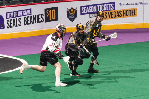
10: San Diego Seals
Among the recent expansion teams, the Seals were the first to go with a purple jersey, with Halifax and Panther City following suit. This design is very evocative of the old LA Kings uniforms, for me. Maybe a little too much—maybe a California team could have chosen something different? But they do look sharp, in my opinion, if derivative.
I’m still not sure about the team logo. That seal with the crown looks kinda scary. Perhaps that’s the point.
This is another design that earned a wide range of opinions, with our staff rating them anywhere from fifth-best to 13th.
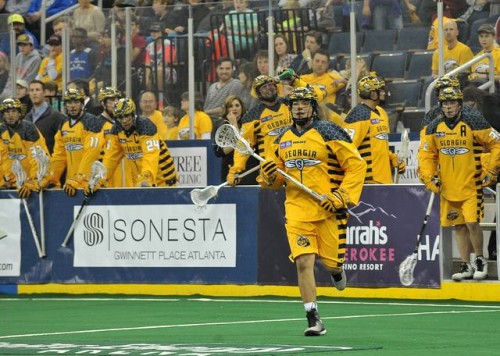
9: Georgia Swarm

Remember above when I called the Swarm’s gold uniforms an abomination? They’re better now. Still not awesome, but at least they won’t burn your retinas.
The Swarm’s logo is interesting, but because it’s basically just a line drawing, it’s hard to see from a distance, which I consider to be a problem. The front of the jersey just looks like a smudge unless you’re up close. But the white uniforms are much easier to look at than the old gold tops. The dark blue home jerseys are clean and decent looking—it’s hard to go wrong with blue and gold.
Among our writers, this is yet another outfit with a range of opinions, with the Swarm’s jerseys ranking as high as third and as low as 12th. So this one is also polarizing.
8. Buffalo Bandits
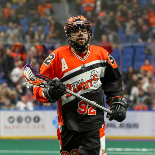
The Bandits have been wearing these throwback jerseys for awhile now and I’m here for it. The retro look is nice. They look completely unique, with their interesting angles and colour scheme.
Orange and black is one of those colour choices that doesn’t show up much in sports, but really seems to pop. Maybe more teams need to look into it to spark some interest?
Yet another jersey here with a wide range of opinions among our writers. This one, like the Swarm, placed as high as third and as low as 12th. Something about these middle-of-the-pack jerseys….
7. Colorado Mammoth
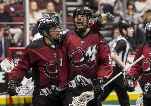
In my opinion, this is the most controversial placement in the entire list. I believe the Mammoth have one of the best-looking jerseys in all of professional sport. The fact that my fellow writers see it differently is shocking to me.
Let’s start with the logo. The great big “M” has tusks, like a mammoth, with the right-most tusk curling into a “C.” So we have the team’s initials cleverly built into the look. The mountain motif in the logo harkens to Denver’s close proximity to the Rocky Mountains. That mountain motif is carried over to the bottom of the jersey, where a snowy mountain range runs across the front and back of the jersey. This is elegant, simple, and beautiful.
And the colours! Typically, teams that opt for red, white, and black go for bright, primary red. But the Mammoth took things to a whole new level with their choice of maroon, which sets them apart from most other teams.
So obviously I placed these jerseys at Number One, where they belong. But the rest my fellow InLax writers apparently see things differently, rating them anywhere between sixth and 11th. I think that’s crazy. But what a boring world we’d be living in if everyone agreed on everything?
6. Toronto Rock
This is another jersey that I rate a lot higher than my peers.
As much as it pains me, as a western Canadian, to say nice things about anything related to Toronto, I’ve always had a lot of respect for this gear. The right blend of red, white and blue combines with a sweet logo. And, like the Mammoth jerseys, the motif of the logo (in this case the prominent maple leaf) is carried over into the trim of the jersey, giving it a look that is classic but also a cut above, opting for the wavy lines of the leaf, rather than traditional stripes. This is a quality look!
I ranked the Rock jersey second-best, behind the Mammoth; other staff members put it as low as 10th overall.
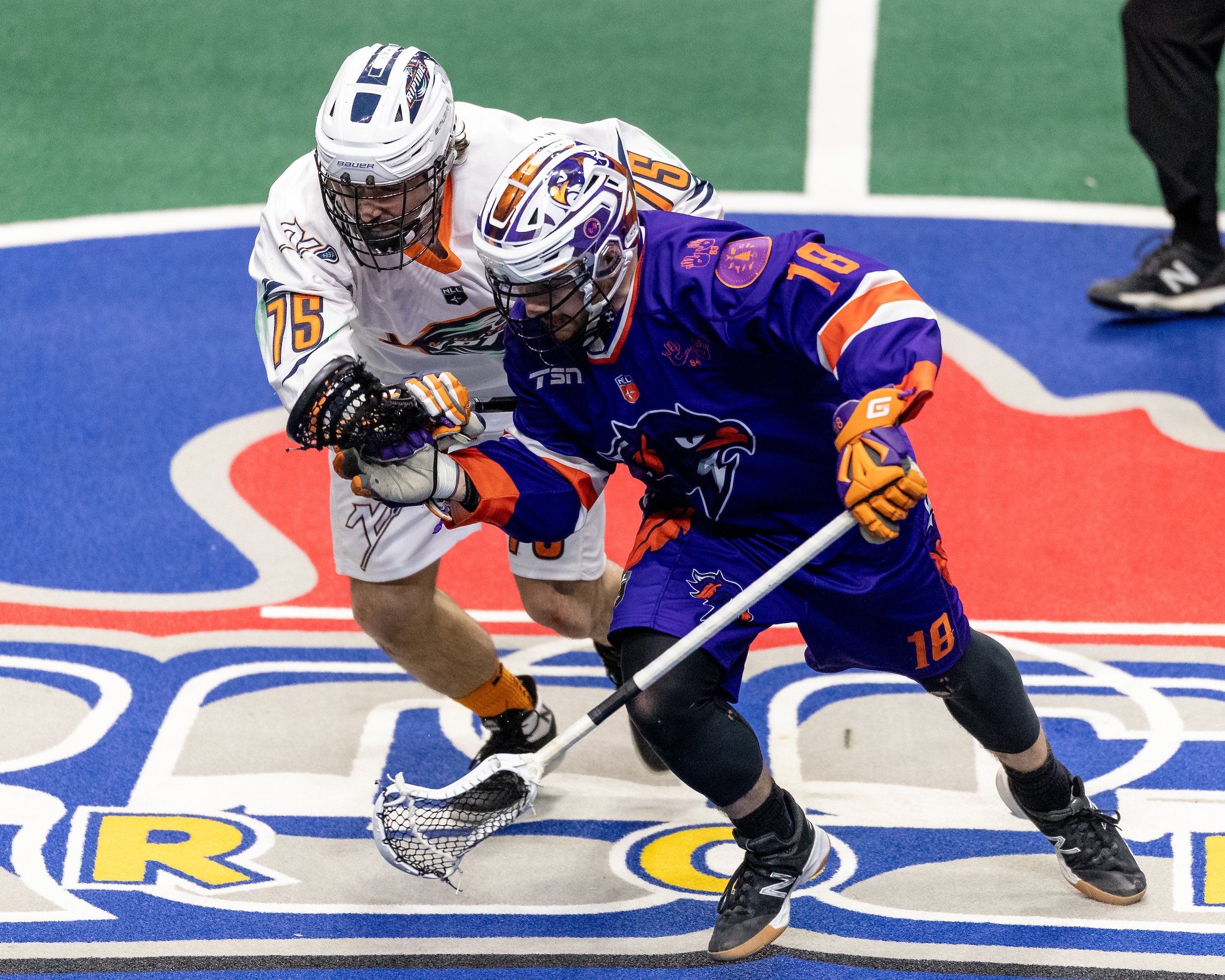
5. New York Riptide
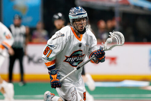
I feel like the colour scheme for the Riptide is a little too similar to that of their Long Island neighbours, the NHL’s New York Islanders. And their whites are a little sparse on the the accents and trim. But they nevertheless feature a bright orange and a dark blue that play well together. The dark jerseys are similarly sparsely decorated, but in both cases, there are a few subtle touches that elevate the look: the “water swirls” from the logo are also found on the sleeves, framing the player’s number, and a neat little “NY” logo appears on the shoulders.
So overall, I think this is actually a decent look. Maybe not flashy, but clever and distinctive.
One of our writers put the Riptide at the top of their list. They also were ranked as low as 10th. So again, a pretty wide range of opinions, but as we break into the Top 5, we’re starting to see some clear leanings one way or the other.
4. Panther City Lacrosse Club
I’m not going to get into the controversial name. Suffice to say, it’s complicated. But let’s talk about their jerseys, which are pretty cool.
The general look is a pretty traditional take on the old school hockey jersey, with a thick stripe of colour bisecting the jersey and the logo (front) and numbers (back) sitting on top of the stripe. The purple and black combo, with just a hint of red accent, is strong. They’ve done some subtle touches with that big stripe as well, adding a bit of movement and extra eye appeal to the look.
I especially like the alternate logos on the shoulders, which depict the big purple cat in the main logo, with its jaws open and the red Texas star that is above the cat in the main logo is now its tongue in that open maw. Creative, cool, and (in theory) intimidating.
All our staff had this as a Top 10 jersey, with one rating as high as second best.
The Top 3
We wound up with a three-way tie for first place in our voting, so using an extremely complicated algorithm (I went with my judgement above all others), I found a way to separate them out from top-to-bottom. So here we go:
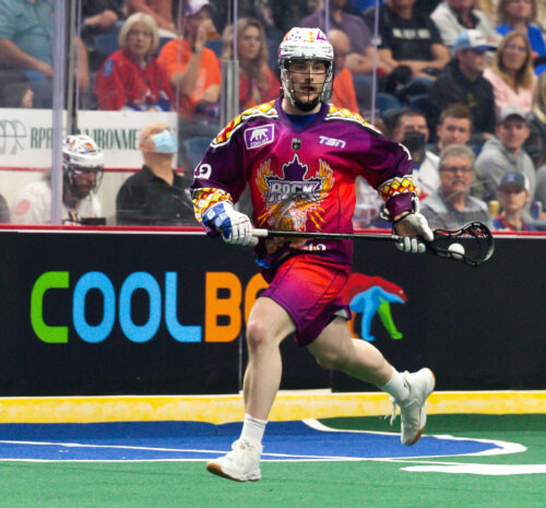
3. Albany FireWolves
I think it’s pretty cool that four of the five newest franchises in the NLL placed in the Top 5 in this competition. It may not mean anything for their on-field performance, but it does suggest they all have people in the front office who know something about marketing.
Albany, like Colorado, has gone with a maroon red, rather than the typical primary colour most sports teams choose. That all by itself puts this jersey a cut above. There are nice tan accents (an interesting switch from the usual gold) added to the trim and the team logo looks appropriately angry and, you know, fiery.
On the white jersey there’s an extra stripe of maroon down the sides that works really well along with the shoulder colour. The red jersey doesn’t include that extra touch on the sides and, for the 2023 season, it appears that they’ve further simplified the look by doing away with the tan trim that defined the shoulders in 2022. So it’s just a solid red top with a logo, numbers and some tan stripes on the forearms; even the team logo on the chest is simplified. I’m not in love with that look, and that’s why Albany slides down to third in this list.
In our poll, the FireWolves had a first and a second place vote, with them sitting as low as eighth in one staff member’s opinion.
2. Halifax Thunderbirds
Formerly the Rochester Knighthawks, the Thunderbirds underwent a complete makeover when they relocated. As noted above, I found this to be kinda sad when it happened, because I was a big fan of the old school Knighthawks gear. There should be more teal in sports….
The good news is that the new Halifax look is really cool. The purple and orange combination is sharp and eye catching. Their team logo is excellent (the bird looks really good—its neck is two lightning bolts that tie in with the Thunder part of the team name) and provides a worthy nod to the First Nations ownership of the franchise (not to mention the origins of the sport).
The white uniform is a little less flashy, with “Thunderbirds” written in all caps down the chest instead of the team logo, à la the New York Rangers and colour accents really only being at the neck, on the forearms, and the numbers on the back.
I appreciate that teams like the FireWolves, Thunderbirds, and Rush are trying to make each uniform look distinctive and not just a “negative” image of each other, but I’m not sure opting for making one awesome and one not awesome is the goal.
Anyway, Halifax earned a second, third, and a fourth place finish in our polls, making it one of the most consistently high positioned teams.
-
Philadelphia Wings
Our winner is the Philadelphia Wings. Full credit to this organization—I’ve always liked the Wings outfits, going all the way back to their previous iteration (which is now the FireWolves). They had a nice combination of red, black, and white, a cool but simple logo, and some interesting design cues on their uniform
The new Wings, established in 2018, came up with a stylish new logo that has to be one of the better team logos in North America. The silver W with a bit of red trim and yellow wings has movement to it, it looks tough, and it is eye-catching at any distance. It looks great on both the white and black jerseys.
The jerseys themselves look really cool. The shoulders have a striped grey wing pattern that runs down past the elbow that not only give the jerseys a unique design, but also harken back to the design of the old franchise’s uniforms. There’s a red stripe up the sides of the jerseys, framed in grey on the black uniforms and in yellow on the home outfits. And then the collar and cuffs are accented as well, with yellow on the black tops and red on the white tops. In both cases, there’s enough going on to get your attention without being over-the-top.
This is what a good looking uniform ought to aspire to: it has style, it’s unique, it has some tradition behind it while still looking very modern. Excellent work!
This is another jersey that earned first-place consideration in our staff poll, with the lowest score being seventh.
So congratulations, Philly! You’re tops in our opinion!
